The Best Artist Websites Have This

Today I’m going to teach you everything you need to make an amazing artist website!
Last month a non-artist business friend of mine asked me to help him find a Sci-Fi artist for a presentation at a conference. The second he asked me I knew of two artists who would be able to fulfill his vision. One was a painter who didn’t have time to work on the project, and the other was a digital artist who had time available.
I went to that artists Instagram page, where they hadn’t posted very much recently, and looked for a website. There wasn’t a link, and when I searched for them on google, I came up empty. I still recommended the artist to my business friend, but the artist didn’t end up being contacted for the job.
I think the reason the business friend didn’t reach out to the digital artist was because they didn’t have a website AND they didn’t have portfolio ready work on their Instagram. It’s a shame because I’ve seen that digital artist do amazing work on Twitch and I wanted them to get the job.
Today I wanted to chat with you about making a website for your artwork. I’ve been developing mine for the last few years and have learned A LOT in the process. From learning about how people interact with the site, to what I want my viewers to do, how to run a blog, formatting tips, and much more.
An Artist’s website can be a simple portfolio of your work or a complex platform that has a shop, blog, or a podcast. Either way is perfect, and I’m going to go over what I think you should look for when building your own.
Questions to ask before you start:
What do you want?
Do you want a website that is a portfolio for your viewers?
Do you want people to interact with the site often and have reasons to come back?
Do you need a site to show off to galleries and coffee shops?
Do you need a blog that gives behind the scenes looks at what you are making?
Does the website need to make money through ads or an ecommerce?
Does the website need to support another digital platform you have, like YouTube?
Write down a list of all your ideals for your website and then look up other artists that have websites. Take notes of what you like!
What Is Your Brand Identity?
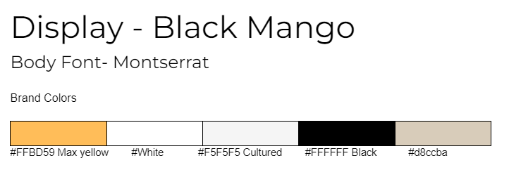
This could be a whole podcast in itself, but here are the basics: Brand colors, font, logo, and language. Having 5 brand colors, a few fonts that you use consistently through your site, a logo that represents your work, and a language that give your brand a unique voice will take you far.
What Platform Will You Use?
This isn’t sponsored, but I use Squarespace for my website. Some people use other website builders that have ready made templates, some choose to build their own.
I really like using a platform that already has the bones of a website made up for me. As an artist, I started with almost no website design experience. Through using Squarespace I was able to train my eye to what looks good. Plus it has all these fun add on features that I’ll get into later.
What Is Your Domain Name?
This might be the most important question for you to answer, but remember you can always change it. I HIGHLY recommend having a domain name that matches your social media pages. I’m still fixing some social media accounts that don’t match my website and people get confused on what they should look up.
I own www.stephaniescott.art and www.stephaniescott.com. They both go to the same website. I love the .art ending as it’s a clear statement to what kind of website you are going to get. My Instagram is @stephaniescott.art which is super clear since it matches my website.
One of my brand language pillars is Responsible. When I speak on my podcast or write in my blog, I want to come across as confident and responsible. My username reflects that in a professional way. I chose this because I want my collectors and viewers to feel like they are going to have a no-nonsense experience with my work and my correspondence. Now, people often tell me that I’m dependable- That is by design.
This works for me, but for someone who’s brand is cute and fun, that would be weird.
Let’s have an example. This is CelestialBeanArt, a top tier Twitch streamer with a silly and fun brand.
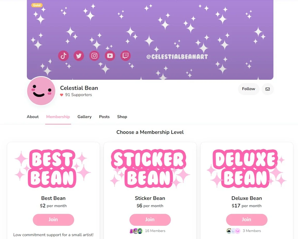
https://celestialbean.com/ This picture is their Ko-fi page
When I go to their website it says right in the description “My style is very cutsy and shiny!” It’s a very simple site, that has a small portfolio, a link to commissions, and a link to their shop. Right at the top however, it has a link to their Ko-Fi page. Their website’s purpose is to support the Twitch Streams and the Ko-fi page. You aren’t meant to hang around the website long, and that’s clear in the design.
Their brand language is cute, shiny, and wiggly. Their colors are white, purple, pink, and peach. All of their fonts are the bubble font plus one more sans font. Their domain and social media handles are the same across the board, from TikTok to Twitch.
The Bare Bones:
Home
Think of the home page as the magazine spread of your website. It should be full of your art with either one big image or several smaller ones that also act as directives for the viewer.
When you make your home page, you should always have enough of an image showing at the bottom of the screen so visitors know they can scroll down.
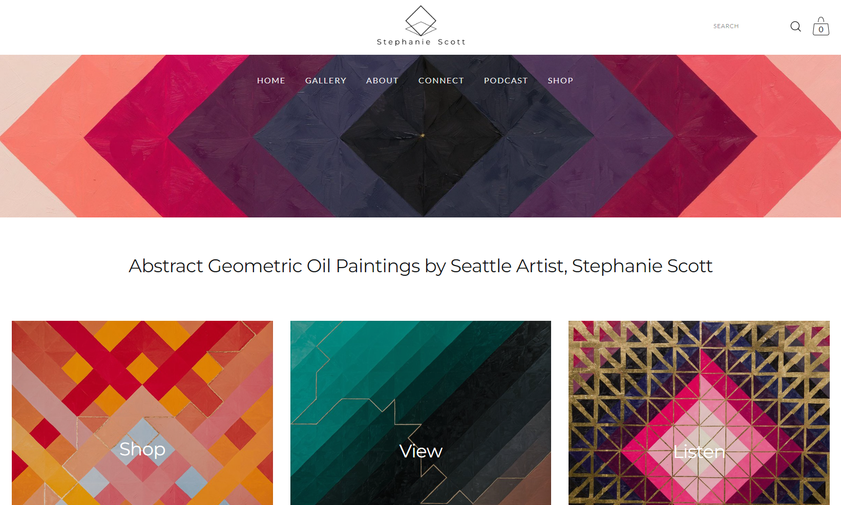
I like to see a statement about your art, that is easily searchable on google. If someone was looking me up to see what my work is about, it’s right there on the front page. Abstract Geometric Oil Paintings by Seattle Artist, Stephanie Scott. Simple and to the point.
I also love seeing pictures of you, the artist, or a few full size shots of your work.
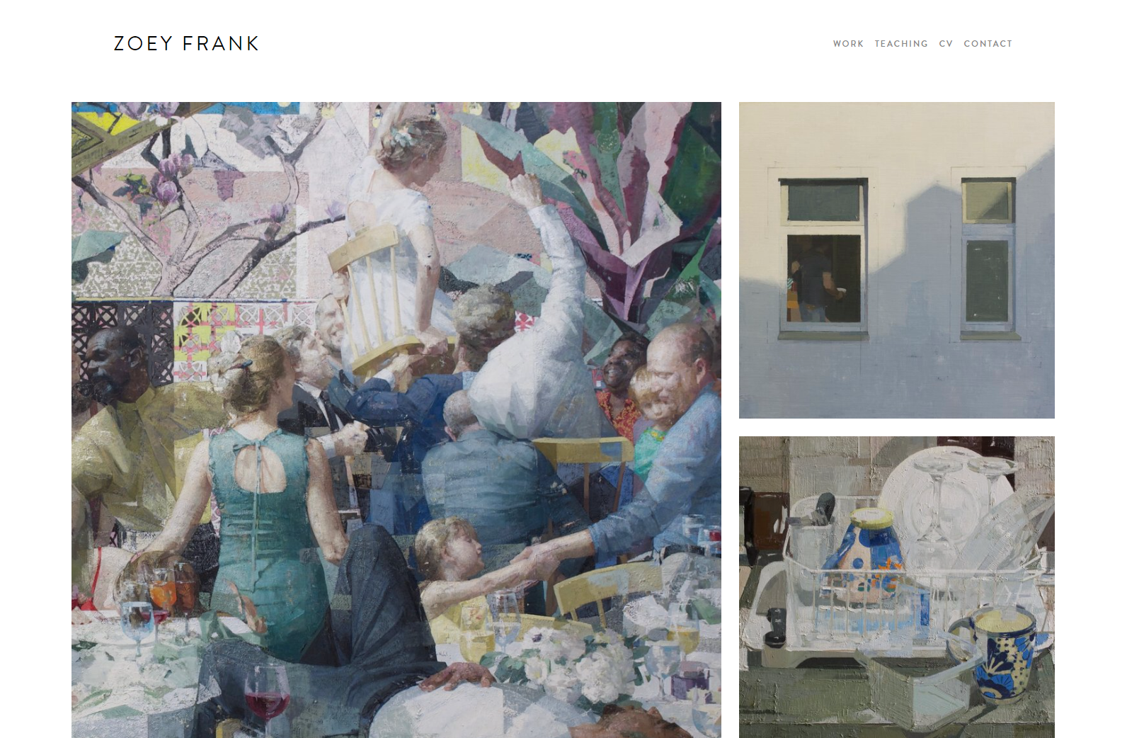
Oil painter Zoe Frank does the simple, yet professional, home page well. It has three photos of her work, in full screen mode.
There are a few links across the top and it’s very elegant. On her site, you are here for the paintings, and that’s it. Perfect for someone with a minimal social media presence and a more traditional artist.
About the Artist/ Artist bio
The artist bio is SO IMPORTANT. The idea is to have a statement about you and your current body of artwork that anyone can copy and use when referencing you. I like seeing a 3 paragraph statement, with an excellent picture of you in an art like setting.
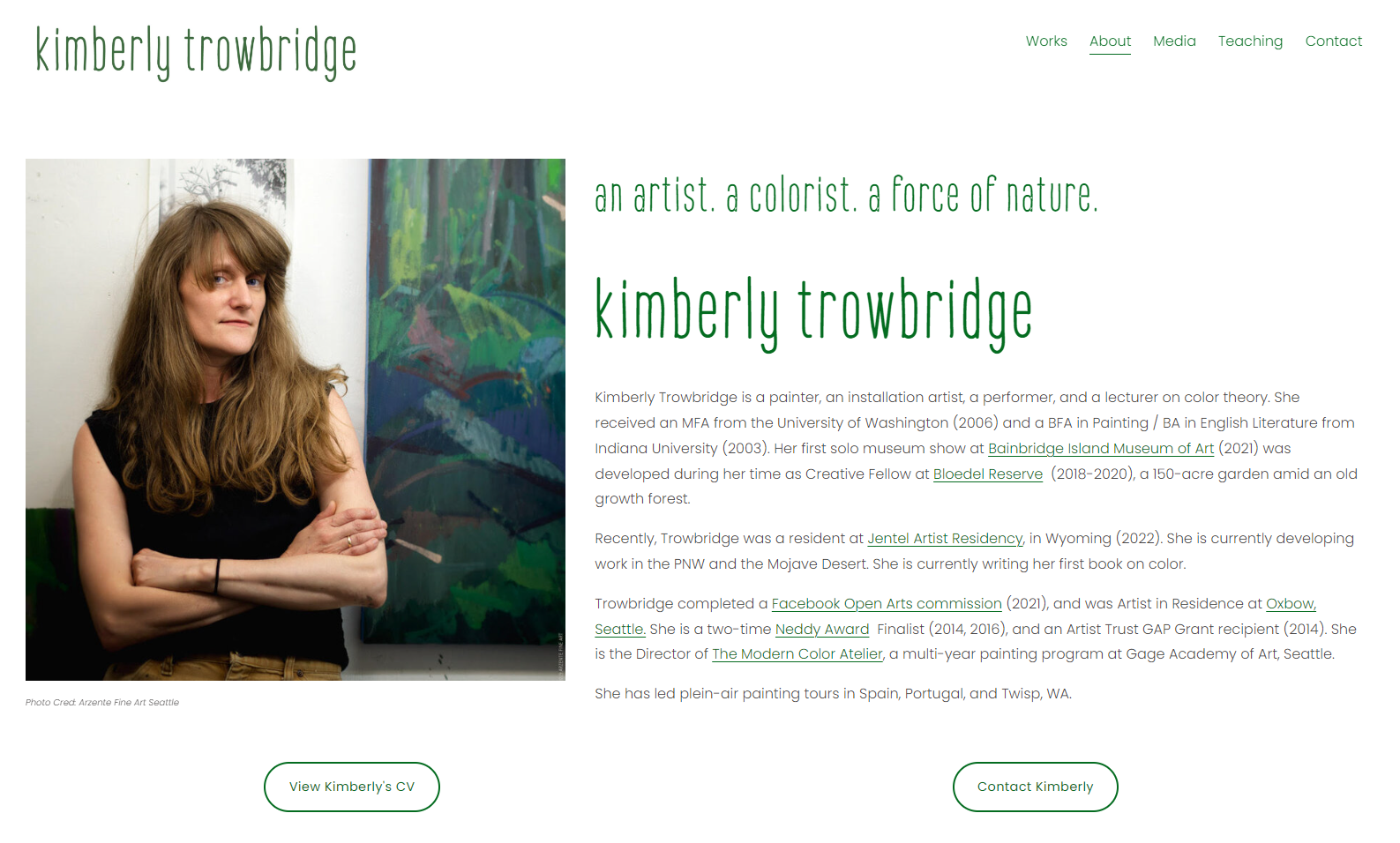
Painter Kimberly Trowbridge has a beautiful one:
In Kimberly’s About page she’s got a picture of her with her work, looking right at the viewer. This is super welcoming and makes her collectors feel the human face behind the work. If you are uncomfortable with having a headshot of you on your website- you can put your logo here. However, I strongly suggest going with a great photo of you and your work. People connect to faces and just by seeing yours, you become more trustworthy (and worthy of buying art from).
In the page she’s got her statement, it goes over her style of work, places she teaches, awards she’s received, and what she’s working on now.
If you click on the page link, you’ll also see that you can scroll down further. She’s got links to her resume, a video of her talking about the artwork, a quote, and a few other interactive things. This is extra, but Kimberly’s website wants you to stick around for a while, so that makes sense.
Portfolio/Gallery
This is where you are going to showcase your artwork. If there’s one thing I’ve learned from website making, it’s that you don’t have to show everything. In fact, you shouldn’t show everything you’ve ever made.
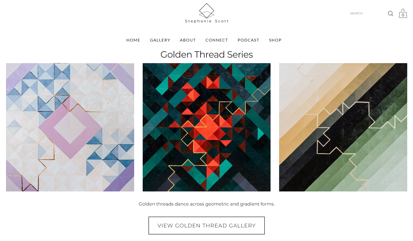
When I first started painting, I primarily did equestrian art and landscapes. You won’t find any of that on my website now. This is your moment to really think back on your work and your brand. How are you categorizing your artwork? What kind of art do you make/sell? I encourage you to niche down as much as possible. I’m not an abstract artist, I’m an abstract geometric oil painter. You aren’t a portrait artist, you are “celebrating the existence of the female form while pushing the boundaries of society and express our collective experiences as women.” (Cassidy Austin Studios)
On my website I have an overview page featuring 5 categories of abstract painting that I make. Each category has 3 big images that display the distinction of the style and an invintation to view the full gallery page.
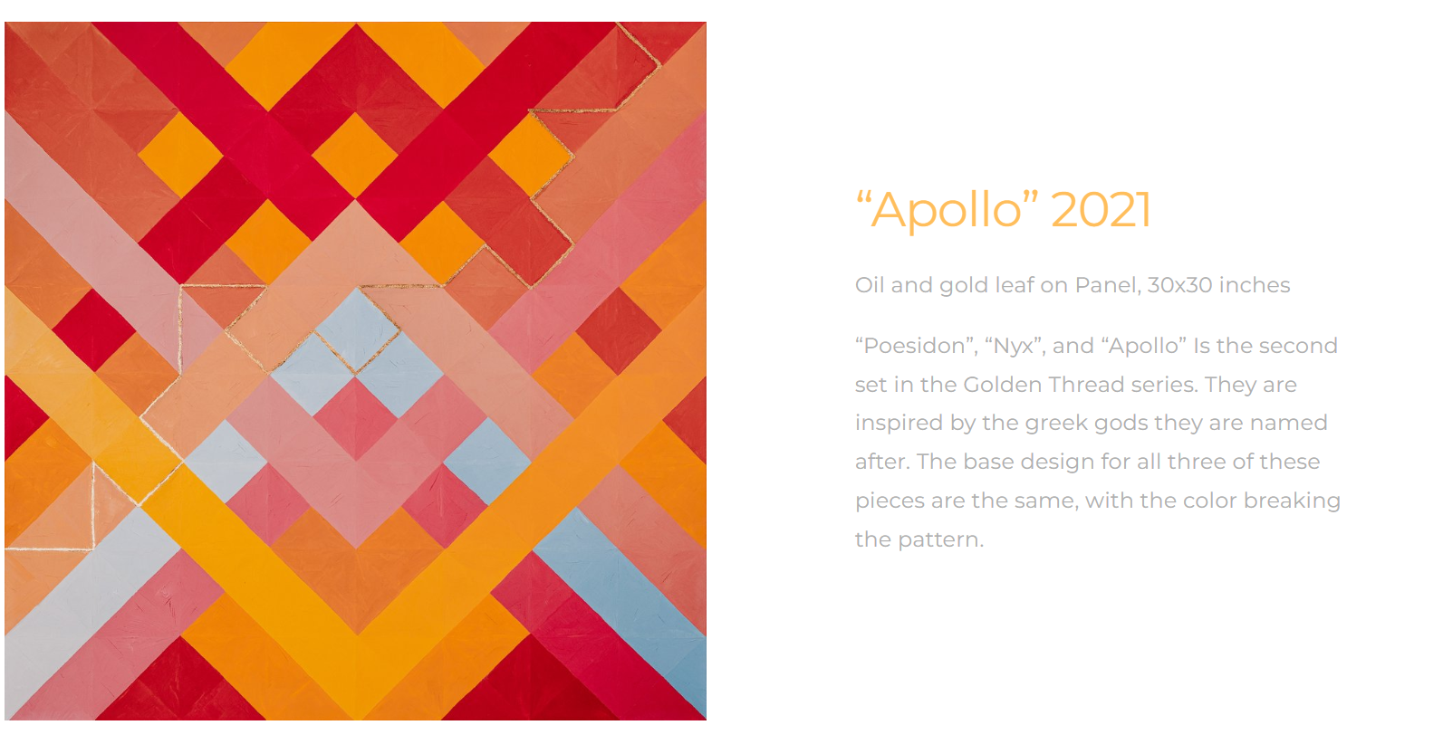
When the viewer visits the gallery, I pick and choose which paintings I think are great (or am trying to sell) and then write little descriptions about them or their sub collection.
You could put your art pieces in a collage style or a list. You want to make sure each image is a decent quality to look at on any devise.
Contact
People need to be easily able to contact you from your website. Decide early how you want this to happen.
I like to have 2-3 ways people can contact you. Mine has my email, a link to my instagram, and a form that can be filled out directly from my website. I’ve also got a picture of me and my work as a subtle reminder of who they are talking to. Faces matter! The page is simple and to the point.
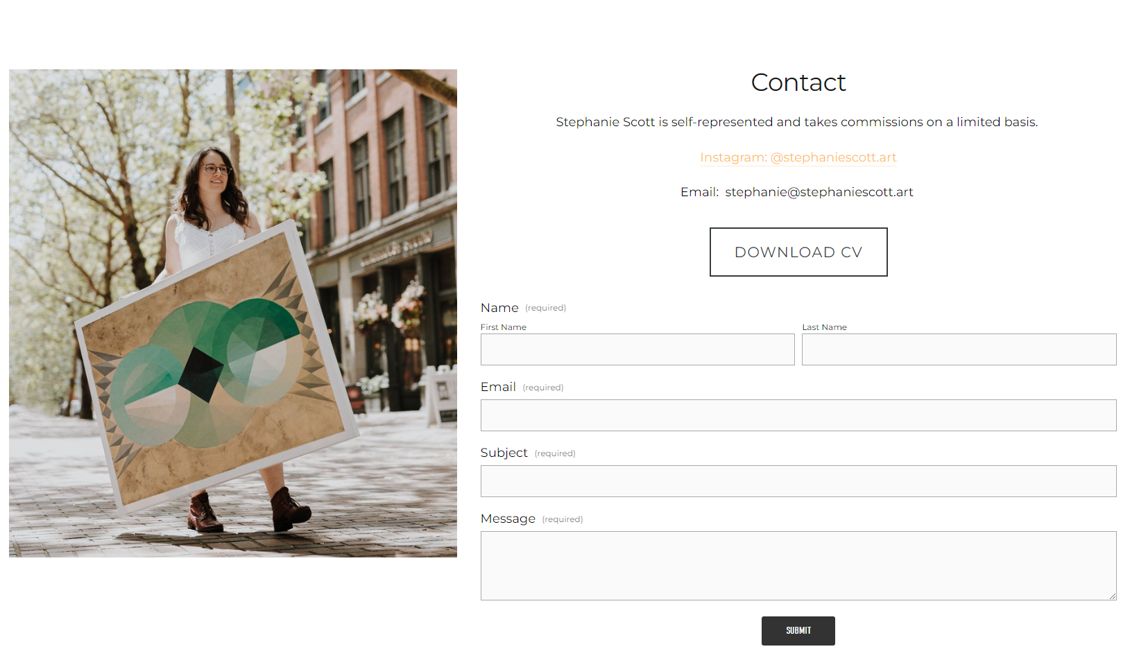
CV/Resume
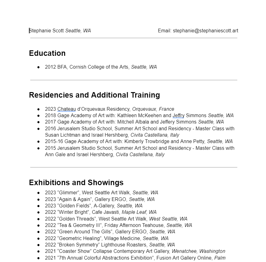
You’ll notice on this page I’ve also got a link that says ‘Download CV’ . This takes the viewer to a downloadable google doc that has all my notable shows, education, and awards. I used to have this as it’s own page on my website, but I found that people weren’t viewing it at all. Plus, when people want your CV, they usually want a copy of it for art show reasons. Your website formatting and flashy photos won’t make that easy for them. But if it’s a pdf that can be printed out in a single click- that’s much better. Make things easy for people to work with you.
Link in bio page
This is a page you are going to build to add to your Instagram, TikTok, or wherever you want people to click on links from their phone. Instead of getting a link tree or whatever, having this handy link page straight from your website is easy and eliminates another company for you to pay.
Mine has links to pages I want people to visit, things I might have referenced in recent posts, and a schedule to my live streaming pages. On my instagram page it’s my website with the /links to it. It brings you to my links page which has things like “Enter the Giveaway” and “Visit the Shop”.
Use your branding language here so instead of saying “Twitch” you’ll say “Watch Me Paint Live”. I like action words, they get people to do things.


The Extras:
These next groups are things you could add to your artist website if you wanted people to stick around longer. These take effort to upkeep, where the bare bones website just needs updating when you’ve got a new painting finished.
I’ve got most of these on my site, but I’ll be showing you examples from my friends websites when applicable.
Blog
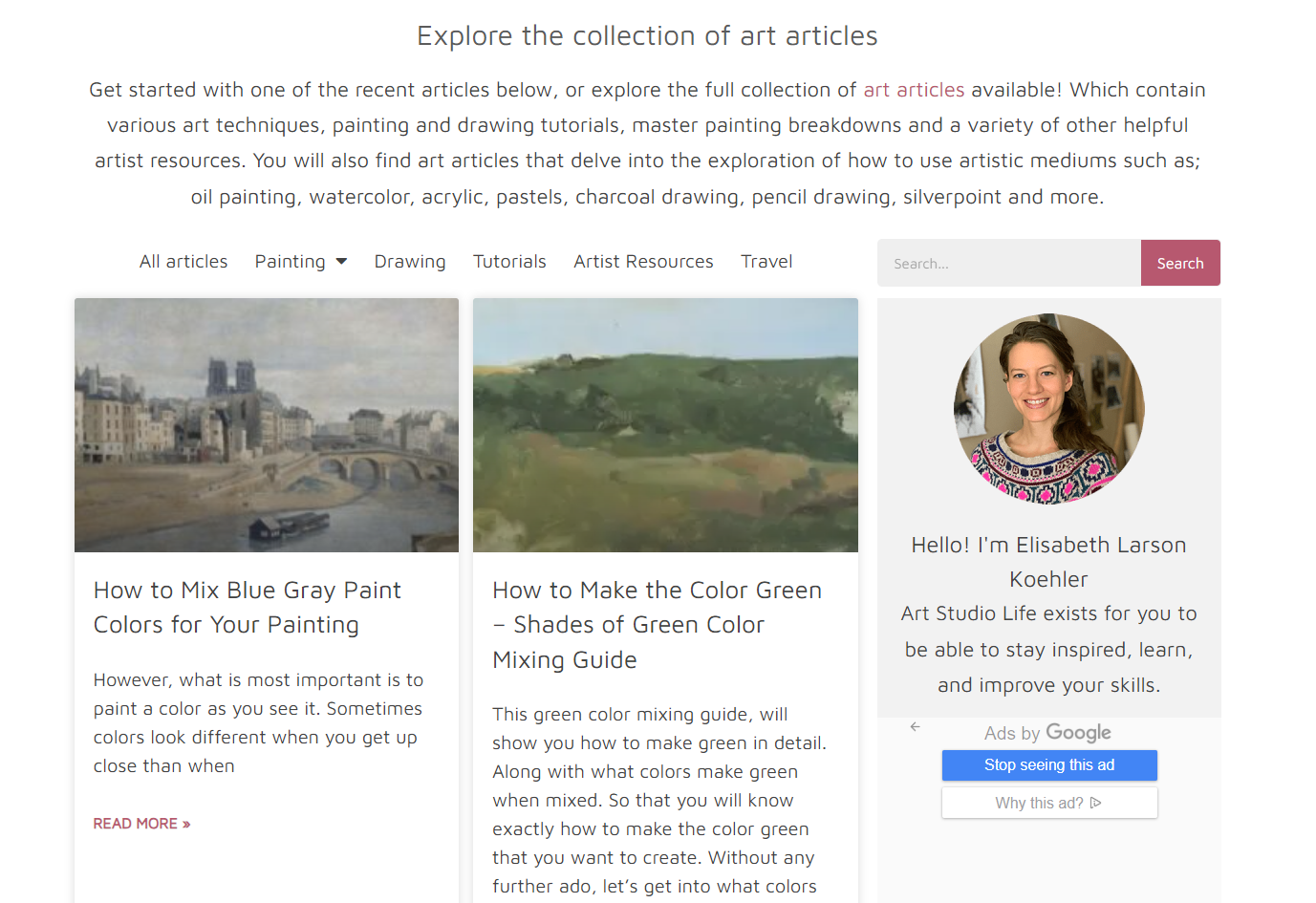
My blog is called Studio Notes I use it to announce shows, to update people when I’ve got new work in the shop, and sometimes tutorials. Blogs are really powerful money makers if you pull in ads like my friend Elisabeth Larson Koehler from Art Studio Life. The blog, which is run by her and her husband, brings them a living wage.
https://artstudiolife.com/ Uses ad revenue and brand deals for the majority of their income. In a recent Brush Work episode Elisabeth described it as free knowledge in the exchange of viewing a few ads. You get high impact content with a ad here and there that doesn’t disturb the learning experience.
News/Announcements
Similar to a blog, but used just for current events. If you are someone who frequently has shows, having an events page could be very useful to your website. This would be a page you could easily link people to when they ask ‘So, what’s next?’. On this sort of page, you should have all the event info, links to appropriate venue sites, and other relevant information.
Podcast
Hosting your podcast on you website is super easy and a great way to run it. I like using squarespace for Brush Work, because it allows me to schedule release dates in the future and write up snazzy articles that match the podcast like this one.
You can add in graphics, links to other pages, and easily connect it to platforms like Spotify and Apple Podcasts.
I’m also a fan of how easy it is to browse past episodes I’ve done. I’ve got a years worth of podcast episodes and some of them are evergreen content. With hosting the podcast on my website I’m keeping my listeners in my little corner of the internet.
Email List
There is nothing so delicious as hearing the words “Will you email me about your next show?” YUM. An email list is a powerful money making tool, and having a website that supports that is a no brainer. The people on my email list are my golden ticket audience, my most loyal collectors. I stay in contact with them several times a month, giving them discounts, telling them first about exciting events, etc. What I love about this website is that it gives me great analytics on my emails. I see who opens them, who clicks on a link from the email and comes to my website, and more.
To get your result, enter your email!
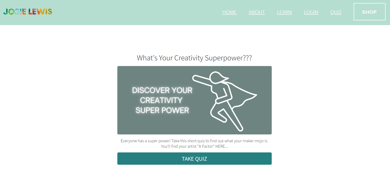
Email marketing is usually an extra charge for a website, so if you are going to add this on, I’d really commit to it! One way I get people to sign up for my email list is to enter them into a monthly giveaway if they do. Some people will have ebooks that they give to new subscribers and others have quizzes, like this from Josie Lewis’s website. Josie runs a multi 6 figure art business and a big part of that is from her email marketing. https://www.josielewis.com/quiz
Shop

Ingrid & Ching https://ingridandching.com/collections/originalsmini
If you want to sell your art online, having your shop within your website is a great idea. There are many online platforms for selling your work like etsy, ebay, shopify, and more. What I like about having my shop on my website is that I can easily integrate it into my other pages, emails, and social media pages. Some platforms take a cut of what you are selling, some will help you calculate taxes and shipping, some have no ecommerce abilities at all. Whether you are displaying products that you will send an invoice for later or having a print on demand item that’s produced by a third party, having an online shop has limitless possibilities. This page by Ingrid & Ching is a beautiful shop. It doesn’t have the prices on the front page, keeping it clean so you can simply focus on the artwork.
My biggest tip with online shops is to be consistent across your items. Format your information the same every time, have the prices clear, and your shipping policies written out.
A question I love to ask is: “How many click till someone can buy something?” Try to keep it under 5. Get to the shop, select the art, add to cart, fill in information, and submit. If you have more steps than that, it’s too many.
Commissions
Recently I redid my commissions page on my website. Commissions are my bread and butter, so I want a page exclusively dedicated to the process. My goal is to make it easy and interactive. On the page I’ve got my styles of painting, the pricing details, shipping options, an intake form to fill out, and my copyright notice. It’s clear for the collector and it gives me all the information I need to commence the commissions right away.
I’ve also made a version of the page that is a pdf that I can send to people who inquire off my website. It looks really similar and has my updated commissions costs inside.
Specialty Event Page (Live Wedding Paintings)
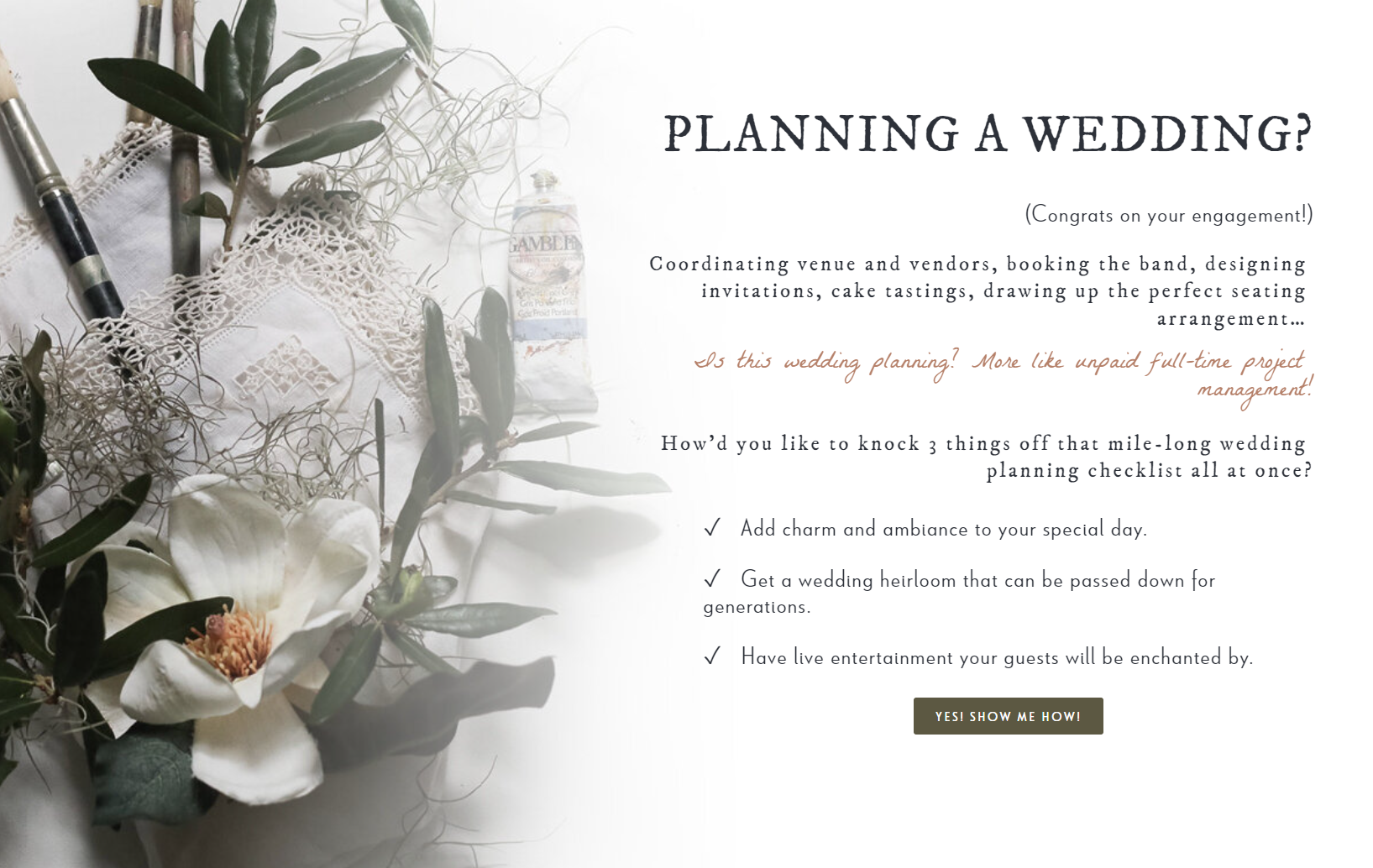
Do you have a special event that you preform as an artist? Oil Painter Kristin Cronic does live wedding painting here https://www.kristincronicart.com/live-wedding-painting and her web page for it is stunning. It presents a problem and gives the easiest, most beautiful solution you’ve ever seen. Live paintings, classes, or workshops deserve a place of their own on your website that reflects how great your event is.
Teaching
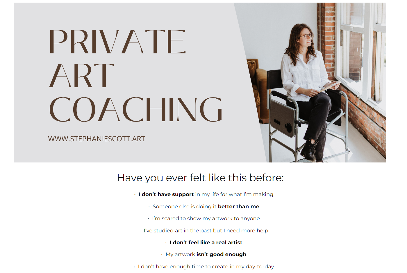
If you have a class, coaching, or workshops you do- a website is critical. I know that before I take a class, I research it. I want to see the way you are writing about it, examples from other students, problems you can solve for me, and what the cost will be. I offer Private Art Coaching to a select number of students each month, and my landing page for the classes reflects that exclusivity.
https://www.stephaniescott.art/11-private-art-coaching to see the full page. Like specialty events my page answers these questions:
What problem will the class solve?
How long is the class?
Where will it be held?
What will be taught?
How much is the class?
I also have the ability to schedule a class on the page which leads me to the next section.
Scheduling/Appointments
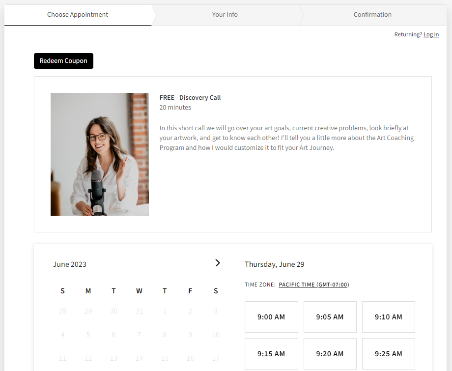
Being able to schedule my coaching sessions through my website is a godsend. Each month I open up times in my calendrer on the website and open up sessions for people to become my students. I pay extra for this feature here on squarespace, but there are other places out there that have free plug ins for your site.
When someone signs up for a class, they get their zoom link, a reminder to their digital calendar, and an email confirming the details- automatically. This saves me a lot of time and fewer things get forgotten this way.
If you teach at all, I recommend giving this a try!
Subscriptions
An ingenious way to make money through your website is by having a monthly or quarterly subscription. Think of this as a super secret club just for people who like you the most. For a static $ amount each month, you could send out prints, stickers, postcards, tiny paintings or anything else your eyes can dream of. I know being an artist is unpredictable when it comes to income, having a subscription option on your website is a great way to help mitigate that.
I’m thinking of doing a postcard club sometime in the future. Would you be interested in getting a 4x6 fine art print to your mailbox each month?
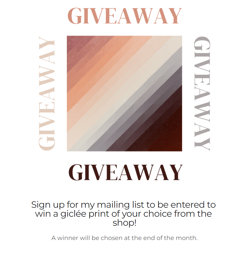
Giveaways/ Freebees
A giveaway is a great add on for your website. It get’s people engaged and thinking about your art. Each month I give away a fine art print to one of my email subscribers. I’ve seen people give away ebooks, tutorials, digital downloads, etc. in exchange for emails, page views, and interest to the site in general.
On your giveaway page, I highly recommend having clear terms for winning, what exactly the winner will receive, and details on how the winner will be contacted.
https://www.stephaniescott.art/giveaway
Speaking of, I’ll be giving away a print soon! Make sure to sign up for my mailing list today!
The Results:
After you’ve had your website up for about two weeks AND you’ve been showing it to people, you can start to see the results of your work. The next three sections are some of the most important reflective tools you can use with your website.
How are people using it - Hotjar
https://www.hotjar.com/ Hotjar is one of the most useful tools I’ve used for my website. Through hotjar I can see how people are using my website, what they are clicking on, how far they are scrolling down on my pages, and more. I’m currently using their free software and it’s been invaluable to my website.
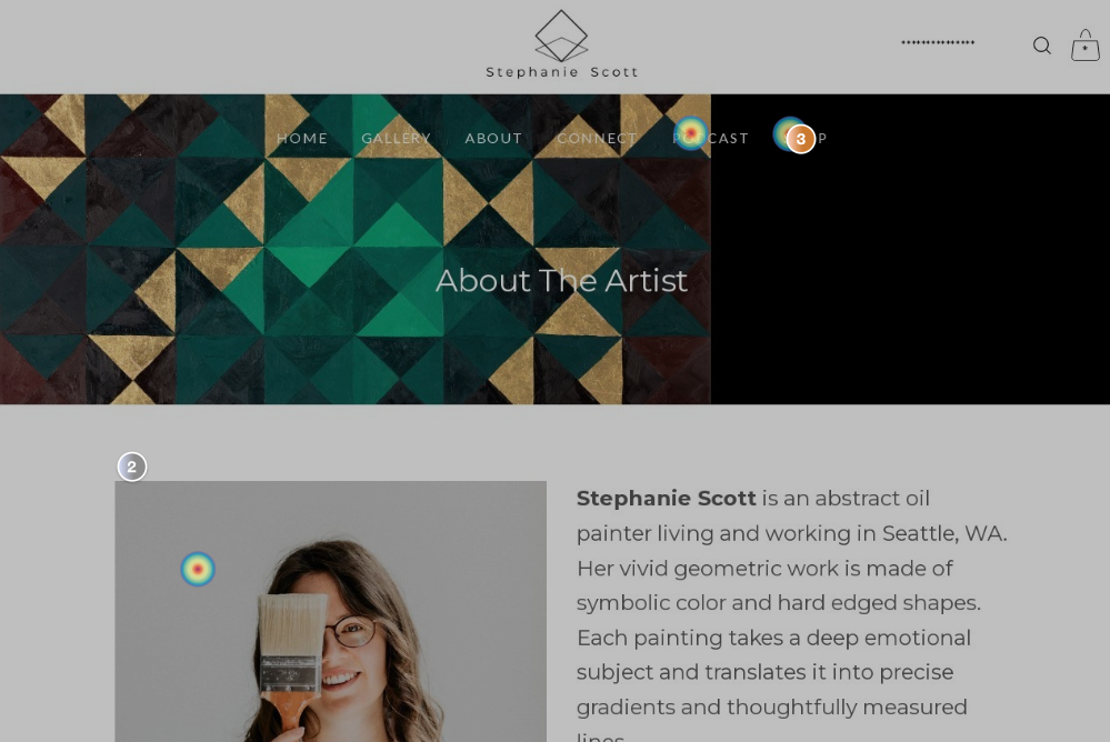
This screenshot is from one of Hotjar’s heatmaps of my About The Artist page. With this data I can see that a few people have saved my artist’s photo, have highlighted the text of my artist bio- this makes sense since I’ve had my art in a few online gallery shows in the past month and the gallery owners have needed my info. I can also see that website visitors have clicked on my podcast page and my shop after reading about me.
In other spaces I’ve seen that some of my webpages get no traffic at all, and some are viewed very often, even though I haven’t given them much effort. Hotjar will tell you how people are using your website and therefor, how to improve it.
Desktop vs Mobile
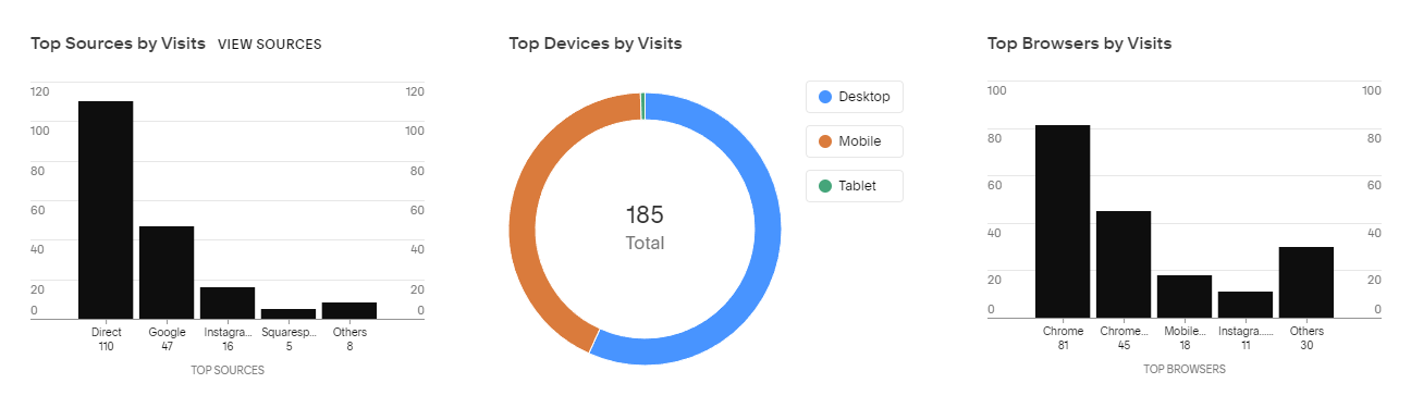
Within your website’s analytics, you are going to find all sorts of useful information. Top Devices by Visits is golden information. 65% of visitors (over a 30 day sample) are seeing my website on a desktop. This is mostly because I stream on Twitch. Because it’s well over half (some months up to 80%) I design my website to be viewed on a desktop.
Most things are oriented for desktop viewing. Luckily, the templates here on squarespace have great versatility. The things i make for desktop viewing still look great when viewed on a mobile device. I’m not alienating my mobile viewers, but i am catering to the desktop people. I’m also able to see that collectors of mine primarily buy from their desktop too. Even more incentive to make my website desktop friendly.
Other Analytics
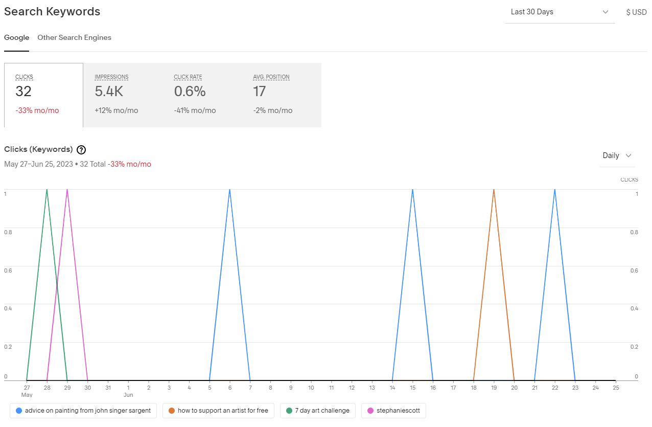
Every once in a while I look up the search keywords people use on my website and how people find me here on the internet. It’s a low traffic month for me here, but people have responded well to my past podcasts and a few art challenges I’ve written about.
Things like this give me more ideas for Brush Work episodes, blog posts, and things to talk about on Instagram. It’s really cool to see what’s doing well and occasionally something will go viral. I have this Art Book Club post from three years ago that gets hits all the time! So now it’s a regular on the podcast.
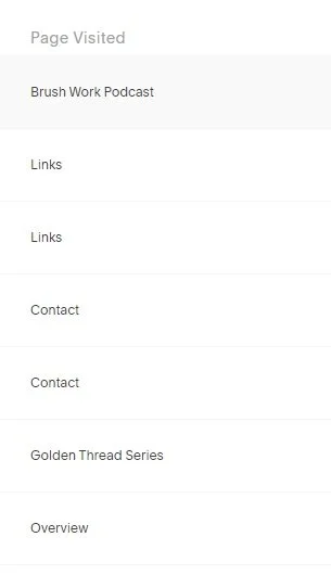
The last thing I’ll talk about is the Page Visited log. Through your analytics you can see where people are clicking around on your website, in the order they’ve clicked. This is super useful for seeing patterns. For example, I’ve noticed that when people click on my Golden Threads Gallery, they usually go to the shop right after. Neat right?
This is also great for seeing where people aren’t going. Your time is important and you want to be spending it in places people will actually visit on your website.
I hope this has been a helpful guide for you and your website! If you’ve done a website refresh because of this blog post, let me know in the comments! I’d love to see it.
Need some extra help on your website? I’m offering $10 website audits for listeners of this episode! Send me a DM with Audit in the comments for 30 min of help!
Host and artist Stephanie Scott breaks down the practicality of the art career with topics including: sustainable creative practices, social media skills, and the mindsets that keep it all together. New episodes every Tuesday!
Need some art supplies? Check out Blick!
Instagram: https://www.instagram.com/stephaniescott.art/
Website: http://www.stephaniescott.art/brushwork
Music by @winepot https://www.instagram.com/thewinepot/
Podcast Cover photo by Maryna Blumqvist https://instagram.com/picturemaryna